Goldi Vending Group, a new vending machine business, approached me with the task of creating a cohesive brand identity that would stand out in the market. The owner, inspired by his granddaughter, wanted the brand to be both personal and professional. The goal was to design a logo, business card, and trifold brochure that would reflect the warmth and uniqueness of the company while resonating with a broad customer base.
Logo Design
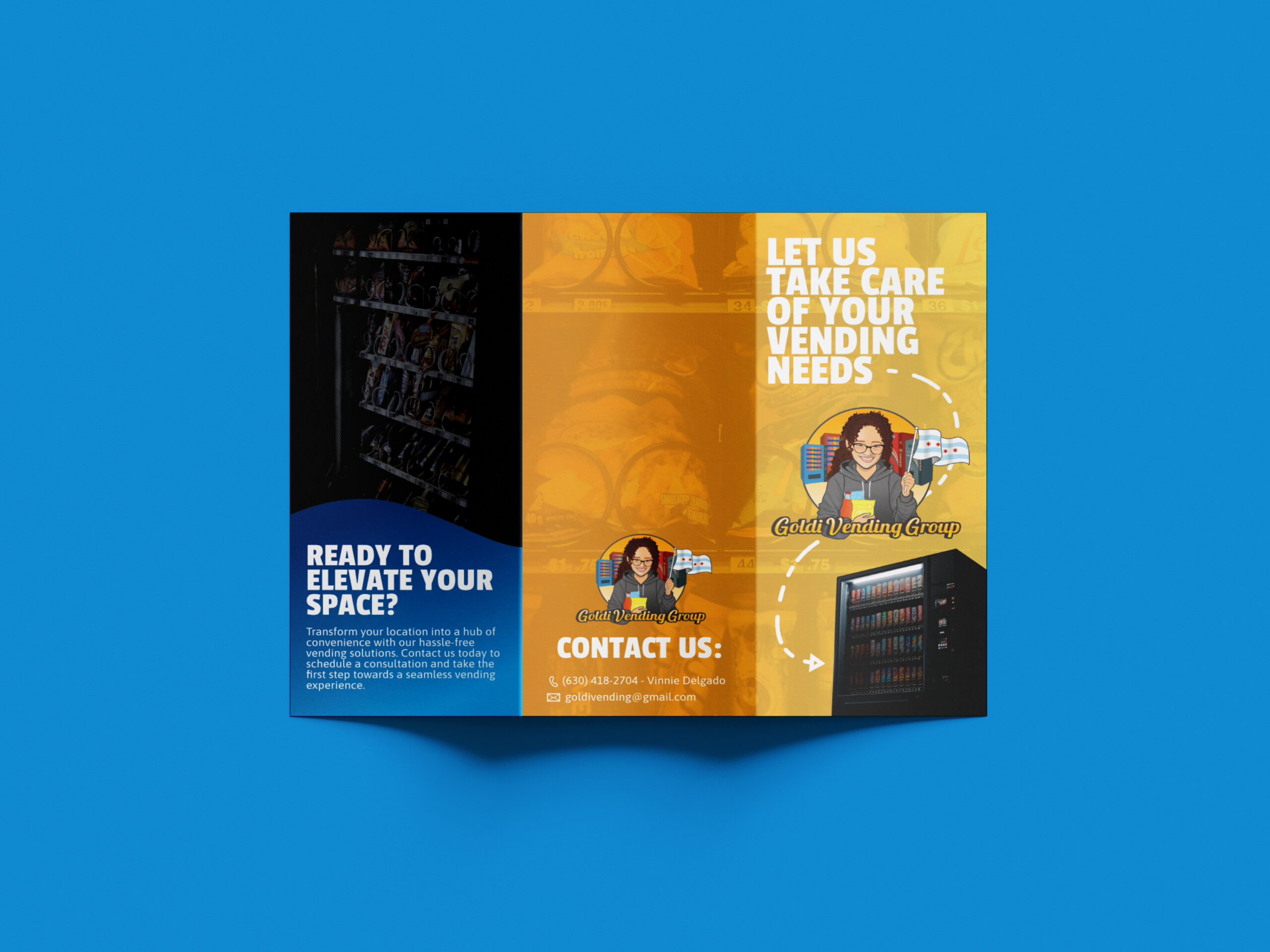
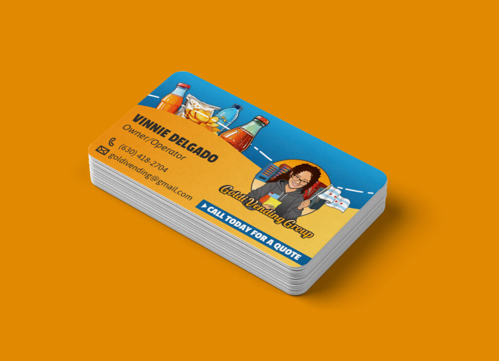
The logo is the centerpiece of Goldi Vending Group’s branding. It features a charming caricature of the owner’s granddaughter, Goldi. Requested to include her cheerful expression and playful demeanor, captured in a style that is both endearing as well as approachable. The caricature is set within a vibrant, yet balanced, color palette to ensure it’s eye-catching but not overwhelming. Features a proud display of the Chicago flag and vending machines as the backdrop. The typography was selected to be bold and easy to read, reflecting the business’s reliability and accessibility.
Results
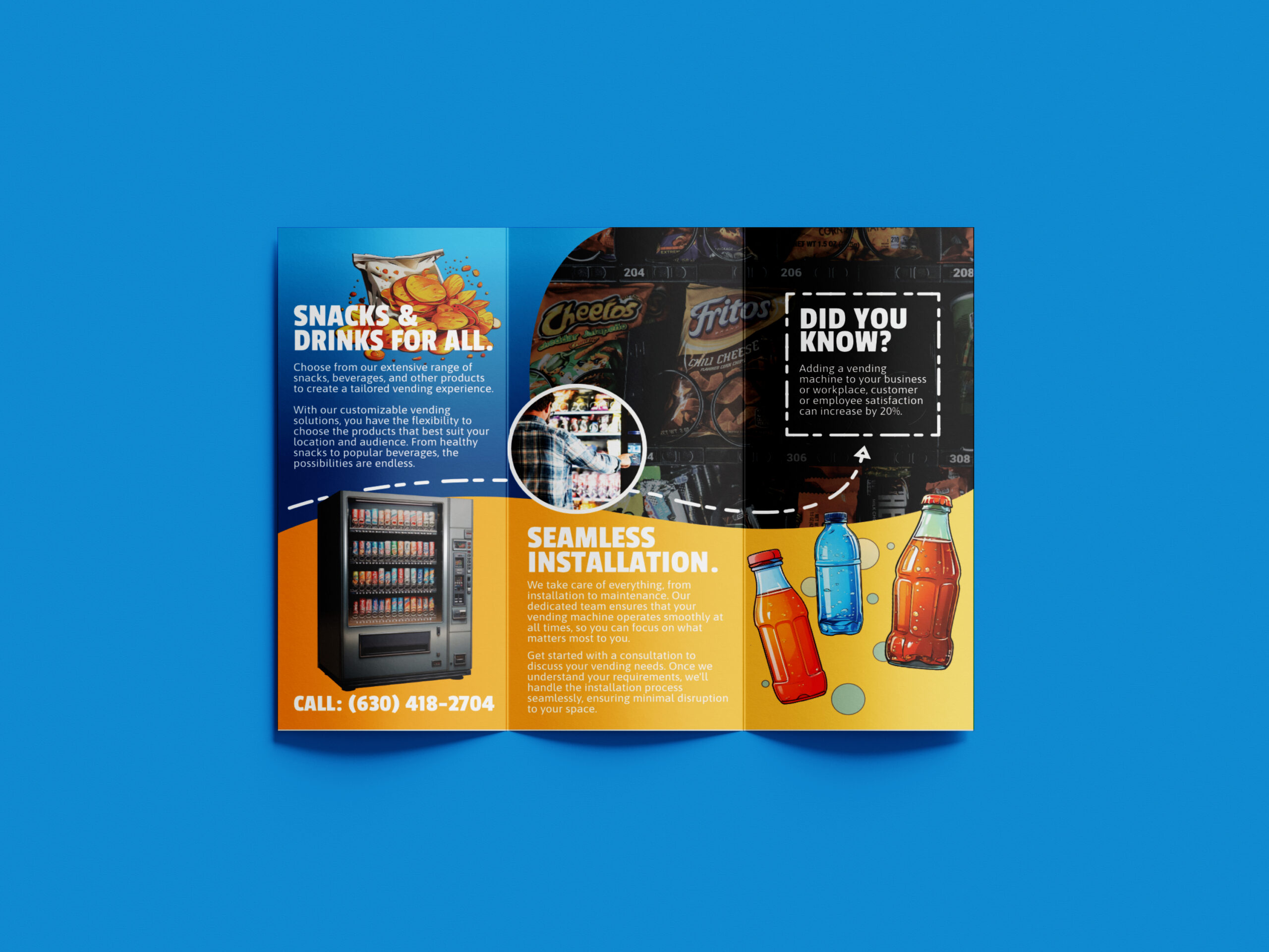
The completed branding package successfully conveyed the personalized and professional image Goldi Vending Group was aiming for. The logo’s unique design made the business stand out, while the cohesive design of the business card and trifold ensured brand consistency. The client was thrilled with the final products, noting that the branding effectively captured the spirit of their granddaughter and the essence of their business.
Conclusion
This project highlights the importance of combining personal elements with professional design standards to create a brand identity that is both unique and marketable. Goldi Vending Group’s branding is a testament to how thoughtful design can help a business connect with its target audience on a personal level while maintaining a professional image.
The Wine Exchange, located in the heart of St. Charles, IL, is a sophisticated wine bar offering a curated selection of wines in an elegant and inviting atmosphere. The owners wanted to refresh their brand identity to better reflect their unique blend of tradition and modernity, attracting a clientele that appreciates fine wine and a relaxed yet upscale environment.
DESIGN OBJECTIVES:
Symbolize the paradox: The logo needed to visually represent the concept of a paradox, capturing the duality of CrossFit’s intense yet balanced nature.
Incorporate fitness elements: It was essential to integrate a recognizable CrossFit movement into the design.